
React Native 之TabBarIOS
前言
學習本系列內容需要具備一定 HTML 開發基礎,沒有基礎的朋友可以先轉至 HTML快速入門(一) 學習
本人接觸 React Native 時間並不是特別長,所以對其中的內容和性質了解可能會有所偏差,在學習中如果有錯會及時修改內容,也歡迎萬能的朋友們批評指出,謝謝
文章第一版出自簡書,如果出現圖片或頁面顯示問題,煩請轉至 簡書 查看 也希望喜歡的朋友可以點贊,謝謝
TabBarIOS 組件簡介
-
目前的APP內,大部分都是選項與選項之間切換,比如:微信、微博、QQ空間…,在iOS中,我們可以通過TabItem類進行實現,那麼,在React Native中,我們可以通過TabBarIOS和TabBarIOS.Item組件來實現選項卡切換效果,大家可以看到後面帶有IOS,所以這個組件不支持Android,當然後面我們會通過自定義該組件來滿足實際開發需求
當然,本章涉及到了
TabBarIOS組件 ,那麼必不可少的,肯定需要與 TabBarIOS.Item 來搭配使用,廢話不多說,先來看它們各自都擁有哪些屬性
TabBarIOS 常見屬性
繼承了View的所有屬性
barTintColor:標簽欄的背景顏色
tintColor:當前被選中的標簽圖標顏色
translucent:bool值,決定標簽欄是否需要半透明化
TabBarIOS.Item 常見屬性
- 默認值:'bookmarks', 'contacts', 'downloads', 'favorites', 'featured', 'history', 'more', 'most-recent', 'most-viewed', 'recents', 'search', 'top-rated'
繼承了View的所有屬性
badge:圖標右上角顯示的紅色角標
icon:給當前標簽指定一個自定義圖標(如果定義了 systemIcon屬性 這個屬性會被忽略)
onPress:點此標簽被選中時調用,你應該修改過組件的狀態使 selected={true}
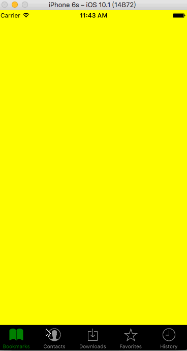
selected:這個屬性決定了子視圖是否可見,如果你看到一個空白的頁面,很可能是沒有選中任何一個標簽
selectedIcon:當標簽被選中的時候顯示的自定義圖標(如果定義了systemIcon屬性,這個屬性會被忽略,如果定義了icon而沒定義這個屬性,在選中的時候圖標會被染上藍色)
systemIcom:一些預定義的系統圖標(如果使用了此屬性,標題和自定義圖標都會被覆蓋為系統定義的值)title:在圖標下面顯示的標題文字(如果定義了 systemIcon屬性,這個屬性會被忽略)
TabBarIOS 初體驗
-
先簡單來看下怎麼使用TabBarIOS
- 首先我們需要引入TabBarIOS
    import {
        TabBarIOS
    } from 'react-native';
-
使用
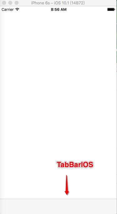
TabBarIOS 很簡單,但是需要配合 TabBarIOS.Item 使用,(需要注意的是我們必須給TabBarIOS設置尺寸,不然可能會造成實例化卻無法看到的問題) render() {
return (
<View style={styles.container}>
<TabBarIOS
style={{height:49, width: width}}
>
</TabBarIOS>
</View>
);
}
效果:
-
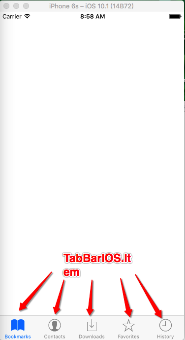
接著我們來給它添加
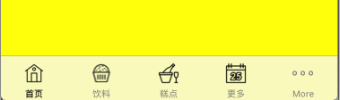
Item(TabBarIOS最多只能包含5個Item,超出的部分會用 more圖標 代替) render() {
return (
<View style={styles.container}>
<TabBarIOS
style={{height:49, width: width}}
>
<TabBarIOS.Item
systemIcon="bookmarks" // 系統圖標(bookmarks)
>
</TabBarIOS.Item>
<TabBarIOS.Item
systemIcon="contacts" // 系統圖標(contacts)
>
</TabBarIOS.Item>
<TabBarIOS.Item
systemIcon="downloads" // 系統圖標(downloads)
>
</TabBarIOS.Item>
<TabBarIOS.Item
systemIcon="favorites" // 系統圖標(favorites)
>
</TabBarIOS.Item>
<TabBarIOS.Item
systemIcon="history" // 系統圖標(history)
>
</TabBarIOS.Item>
</TabBarIOS>
</View>
);
}
效果:
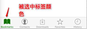
- 當前被選中標簽顏色
    <TabBarIOS
        style={{height:49, width: width}}
        tintColor="green"   // 被選中標簽顏色
    >
    </TabBarIOS>
效果:
-
背景色
    <TabBarIOS
        style={{height:49, width: width}}
        tintColor="green"
        barTintColor="black"    // TabBarIOS背景色
    >
    </TabBarIOS>
效果:
-
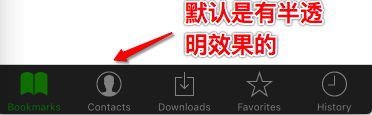
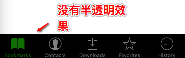
是否有半透明效果
    <TabBarIOS
        style={{height:49, width: width}}
        tintColor="green"
        barTintColor="black"
        translucent={false}     // TabBarIOS不需要半透明效果
    >
    </TabBarIOS>
效果:
- 系統自帶圖標
- bookmarks
    <TabBarIOS.Item
        systemIcon="bookmarks"  // 系統圖標(bookmarks)
    >
    </TabBarIOS.Item>
效果:

-
contacts
    <TabBarIOS.Item
        systemIcon="contacts"  // 系統圖標(contacts)
    >
    </TabBarIOS.Item>
效果:

-
downloads
    <TabBarIOS.Item
        systemIcon="downloads"  // 系統圖標(downloads)
    >
    </TabBarIOS.Item>
效果:

-
favorites
    <TabBarIOS.Item
        systemIcon="favorites"  // 系統圖標(favorites)
    >
    </TabBarIOS.Item>
效果:

-
featured
    <TabBarIOS.Item
        systemIcon="featured"  // 系統圖標(featured)
    >
    </TabBarIOS.Item>
效果:

-
history
    <TabBarIOS.Item
        systemIcon="history"  // 系統圖標(history)
    >
    </TabBarIOS.Item>
效果:
-
more
    <TabBarIOS.Item
        systemIcon="more"  // 系統圖標(more)
    >
    </TabBarIOS.Item>
效果:

-
most-recent
    <TabBarIOS.Item
        systemIcon="most-recent"  // 系統圖標(most-recent)
    >
    </TabBarIOS.Item>
效果:

-
most-viewed
    <TabBarIOS.Item
        systemIcon="most-viewed"  // 系統圖標(most-viewed)
    >
    </TabBarIOS.Item>
效果:

-
recents
    <TabBarIOS.Item
        systemIcon="recents"  // 系統圖標(recents)
    >
    </TabBarIOS.Item>
效果:

-
search
    <TabBarIOS.Item
        systemIcon="search"  // 系統圖標(search)
    >
    </TabBarIOS.Item>
效果:

-
top-rated
    <TabBarIOS.Item
        systemIcon="top-rated"  // 系統圖標(top-rated)
    >
    </TabBarIOS.Item>
效果:

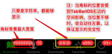
- bookmarks
角標(角標的位置會受到TabBarIOS右邊空間音效,當位置不夠時,會自動往左移動,以保證顯示完整性)
    <TabBarIOS
        style={{height:49, width: width}}
        tintColor="green"
        barTintColor="black"
        translucent={false}
    >
        <TabBarIOS.Item
            systemIcon="bookmarks"  // 系統圖標(bookmarks)
            badge="99999999"
        >
        </TabBarIOS.Item>
        <TabBarIOS.Item
            systemIcon="contacts"  // 系統圖標(contacts)
            badge="15"
        >
        </TabBarIOS.Item>
        <TabBarIOS.Item
            systemIcon="downloads"  // 系統圖標(downloads)
            badge="@$!@"
        >
        </TabBarIOS.Item>
        <TabBarIOS.Item
            systemIcon="favorites"  // 系統圖標(favorites)
            badge="aBBc"
        >
        </TabBarIOS.Item>
        <TabBarIOS.Item
            systemIcon="history"  // 系統圖標(history)
            badge="99+"
        >
        </TabBarIOS.Item>
    </TabBarIOS>
-
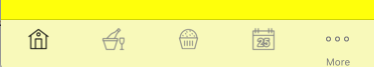
自定義圖標(目前只支持本地圖片)
    <TabBarIOS.Item
        renderAsOriginal={true} // 如果為false,只會顯示純色圖片
        icon={require('image!home')}
    >
    </TabBarIOS.Item>
效果:
-
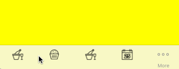
自定義高亮圖標(目前只支持本地圖片,如果沒有設置,則會顯示選中顏色圖標)
selectedIcon={require('image!baker')}
效果:
-
文字(如果設置了系統圖標,那麼這個屬性會被忽略)
title="首頁"
效果:
TabBarIOS.Item點擊
-
到這裡肯定有人會說,為什麼我的
- 首先,要實現頁面之間的切換,那麼首先它們自己要有對應的頁面,這邊先來給各個 Item 設置屬於自己的頁面
TabBarIOS.Item 不能接收點擊事件,無法切換界面,這邊就來講解怎麼去實現頁面的切換,它涉及到 TabBarIOS.Item 的兩個屬性 —— selected 和 onPress
    render() {
      return (
        <View style={styles.container}>
            <TabBarIOS
                style={{height:49, width: width}}
                tintColor="green"
                barTintColor="black"
                translucent={false}
            >
                <TabBarIOS.Item
                    systemIcon="bookmarks"  // 系統圖標(bookmarks)
                >
                    <View style={[styles.childViewStyle, {backgroundColor:'yellow'}]}>

                    </View>
                </TabBarIOS.Item>
                <TabBarIOS.Item
                    systemIcon="contacts"  // 系統圖標(contacts)
                >
                    <View style={[styles.childViewStyle, {backgroundColor:'blue'}]}>

                    </View>
                </TabBarIOS.Item>
                <TabBarIOS.Item
                    systemIcon="downloads"  // 系統圖標(downloads)
                >
                    <View style={[styles.childViewStyle, {backgroundColor:'red'}]}>

                    </View>
                </TabBarIOS.Item>
                <TabBarIOS.Item
                    systemIcon="favorites"  // 系統圖標(favorites)
                >
                    <View style={[styles.childViewStyle, {backgroundColor:'green'}]}>

                    </View>
                </TabBarIOS.Item>
                <TabBarIOS.Item
                    systemIcon="history"  // 系統圖標(history)
                >
                    <View style={[styles.childViewStyle, {backgroundColor:'gray'}]}>

                    </View>
                </TabBarIOS.Item>
            </TabBarIOS>
        </View>
    );
}
-
頁面之間的切換其實就是根據
- 首先我們定義一個初始化變量來確定要顯示的頁面
selected 是否為 ture,以此決定是否重新渲染界面,涉及到重新渲染,所以肯定需要使用到 getInitialState(狀態機) ,具體操作如下
    getInitialState(){
        return{
            selectedTabItem:0   // 預設變量,記錄當前點擊的item
        }
    },
-
當我們點擊相應標簽的時候,系統就會調用
- 首先點擊onPress的時候我們需要更新 狀態機 中預設變量的值
onPress 屬性來進行反饋
onPress={() => {this.setState({selectedTabItem:0})}}
-
接著我們要根據
預設變量 來判斷跳轉到哪個頁面(當預設變量的值改變後,狀態機會再次調用 render 函數進行渲染,也就會調用 TabBarIOS.Item 內的 selected 屬性) selected={this.state.selectedTabItem == 0}
-
視圖部分完整代碼
    var TabBarIOSDemo = React.createClass({

        getInitialState(){
            return{
                selectedTabItem:0
            }
        },

        render() {
            return (
                <View style={styles.container}>
                    <TabBarIOS
                        style={{height:49, width: width}}
                        tintColor="green"
                        barTintColor="black"
                        translucent={false}
                    >
                        <TabBarIOS.Item
                            systemIcon="bookmarks"  // 系統圖標(bookmarks)
                            onPress={() => {this.setState({selectedTabItem:0})}}
                            selected={this.state.selectedTabItem == 0}
                        >
                            <View style={[styles.childViewStyle, {backgroundColor:'yellow'}]}>

                            </View>
                        </TabBarIOS.Item>
                        <TabBarIOS.Item
                            systemIcon="contacts"  // 系統圖標(contacts)
                            onPress={() => {this.setState({selectedTabItem:1})}}
                            selected={this.state.selectedTabItem == 1}
                        >
                            <View style={[styles.childViewStyle, {backgroundColor:'blue'}]}>

                            </View>
                        </TabBarIOS.Item>
                        <TabBarIOS.Item
                            systemIcon="downloads"  // 系統圖標(downloads)
                            onPress={() => {this.setState({selectedTabItem:2})}}
                            selected={this.state.selectedTabItem == 2}
                        >
                            <View style={[styles.childViewStyle, {backgroundColor:'red'}]}>

                            </View>
                        </TabBarIOS.Item>
                        <TabBarIOS.Item
                            systemIcon="favorites"  // 系統圖標(favorites)
                            onPress={() => {this.setState({selectedTabItem:3})}}
                            selected={this.state.selectedTabItem == 3}
                        >
                            <View style={[styles.childViewStyle, {backgroundColor:'green'}]}>

                            </View>
                        </TabBarIOS.Item>
                        <TabBarIOS.Item
                            systemIcon="history"  // 系統圖標(history)
                            onPress={() => {this.setState({selectedTabItem:4})}}
                            selected={this.state.selectedTabItem == 4}
                        >
                            <View style={[styles.childViewStyle, {backgroundColor:'gray'}]}>

                            </View>
                        </TabBarIOS.Item>
                    </TabBarIOS>
                </View>
            );
        }
    });
 到這裡,TabBarIOS頁面切換就完成了,當然實際開發中我們會抽取代碼,使代碼看起來不會這麼雜亂,這在後面會通過綜合項目進行講解
補充
上面出現這樣的代碼,可能很多初學者不知道什麼意思,這邊就補充說明一下,在JS中是允許多個樣式通過數組的形式傳遞的,它會根據數組內容自動去解析需要的值,並根據優先級去選擇優先選擇使用哪個屬性


- Mac Android Studio快捷鍵整頓
- IOS 開辟自界說條形ProgressView的實例
- IOS 陀螺儀開辟(CoreMotion框架)實例詳解
- iOS簡略登錄LoginViewController、注冊RegisterViewController等功效完成辦法
- iOS Remote Notification長途新聞推送處置
- Mac下獲得AppStore裝置包文件途徑
- IOS 波紋進度(waveProgress)動畫完成
- React Native搭建iOS開辟情況
- iOS法式開辟之應用PlaceholderImageView完成優雅的圖片加載後果
- IOS計步器功效完成之Healthkit和CMPedometer
- iOS中應用UISearchBar控件限制輸出字數的完成辦法
- iOS中searchBar(搜刮框)光標初始地位後移
- Android中getActivity()為null的處理方法
- 若何完成IOS_SearchBar搜刮欄及症結字高亮
- 處理Alamofire庫在iOS7下設置Head有效的成績

- iPhone6在哪裡開啟護眼模式?護眼模式開啟方法圖解
- 如何保養iPhone數據線?五招延長iPhone數據線壽命
- 怎麼給給蘋果iPhone6貼膜?iphone6三種膜貼法圖文教程![多圖]
- iPhone音樂播放均衡器調節方法
- iOS7可以用九宮格嗎 iPhone九宮格輸入法設置教程
- iPhone6沒有apn怎麼辦 iPhone6手機網絡apn設置方法
- iPhone 6s史上最詳細3D Touch使用方法全攻略
- iOS9公測版怎麼升級?iOS9公測版升級方法與注意事項
- ios9.0.2觸摸失靈怎麼辦 ios9游戲中心打不開/無法安裝應用怎麼辦
- iPhone6s待機時間短解決辦法 iPhone6s延長待機時間教程