iosiPhone屏幕尺寸、分辨率及適配
1.iPhone尺寸規格
設備
iPhone
寬
Width
高
Height
對角線
Diagonal
邏輯分辨率(point)
Scale Factor
設備分辨率(pixel)
PPI
3GS
2.4 inches (62.1 mm)
4.5 inches (115.5 mm)
3.5-inch
320x480
@1x
320x480
163
4(s)
2.31 inches (58.6 mm)
4.5 inches (115.2 mm)
3.5-inch
320x480
@2x
640x960
326
5c
2.33 inches (59.2 mm)
4.90 inches (124.4 mm)
4-inch
320x568
@2x
640x1136
326
5(s)
2.31 inches (58.6 mm)
4.87 inches (123.8 mm)
4-inch
320x568
@2x
640x1136
326
6
2.64 inches (67.0 mm)
5.44 inches (138.1 mm)
4.7-inch
375x667
@2x
750x1334
326
6+
3.06 inches (77.8 mm)
6.22 inches (158.1 mm)
5.5-inch
414x736
@3x
(1242x2208->)
1080x1920
401
2.單位inch(英吋)
1 inch = 2.54cm = 25.4mm
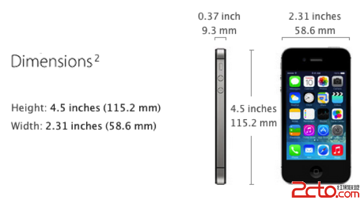
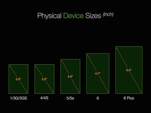
3.iPhone手機寬高
上表中的寬高(width/height)為手機的物理尺寸,包括顯示屏和邊框。
以下為iPhone4s的寬高示意圖:
4.屏幕尺寸
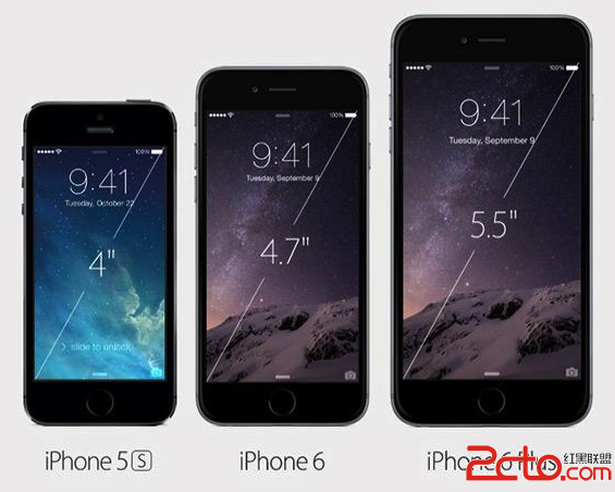
我們通常所說的iPhone5屏幕尺寸為4英寸、iPhone6屏幕尺寸為4.7英寸,指的是顯示屏對角線的長度(diagonal)。
以下為iPhone5~6+的屏幕尺寸規格示意圖:
5.像素密度PPI
PPI(Pixel Per Inch by diagonal):表示沿著對角線,每英寸所擁有的像素(Pixel)數目。
PPI數值越高,代表顯示屏能夠以越高的密度顯示圖像,即通常所說的分辨率越高、顆粒感越弱。
根據勾股定理,可以得知iPhone4(s)的PPI計算公式為:
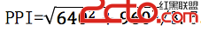
計算結果稍有出入,這是因為像素的離散采樣有鋸齒效應。
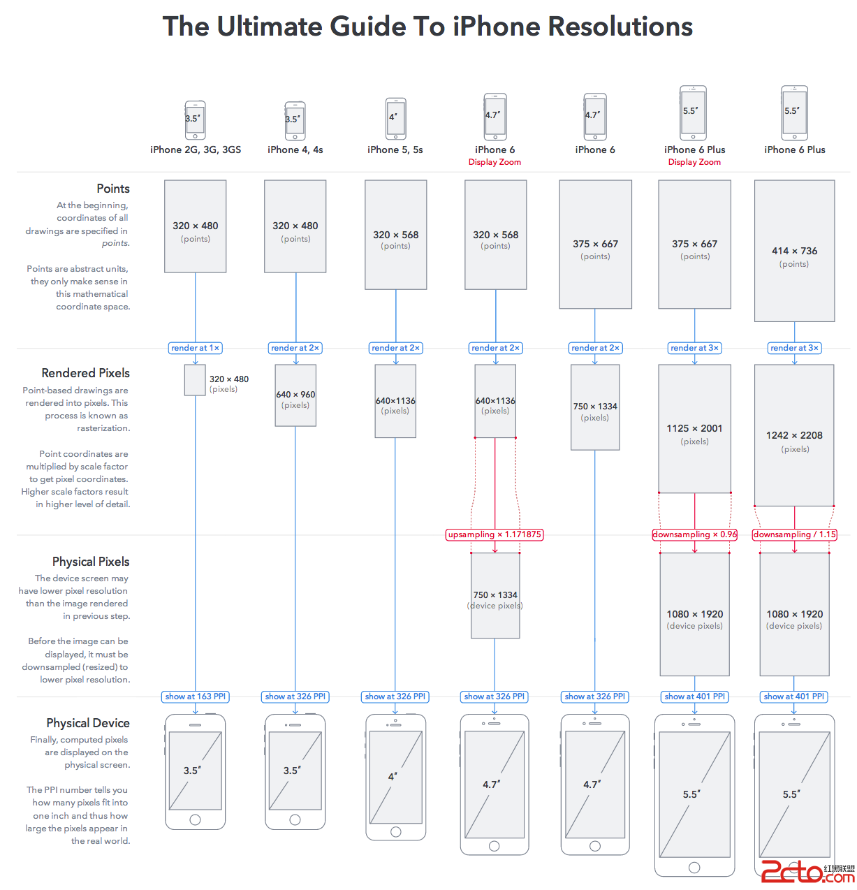
6.縮放因子(scale factor between logic point and device pixel)
(1)Scale起源
早期的iPhone3GS的屏幕分辨率是320*480(PPI=163),iOS繪制圖形(CGPoint/CGSize/CGRect)均以point為單位(measured in points):
1 point = 1 pixel(Point Per Inch=Pixel Per Inch=PPI)
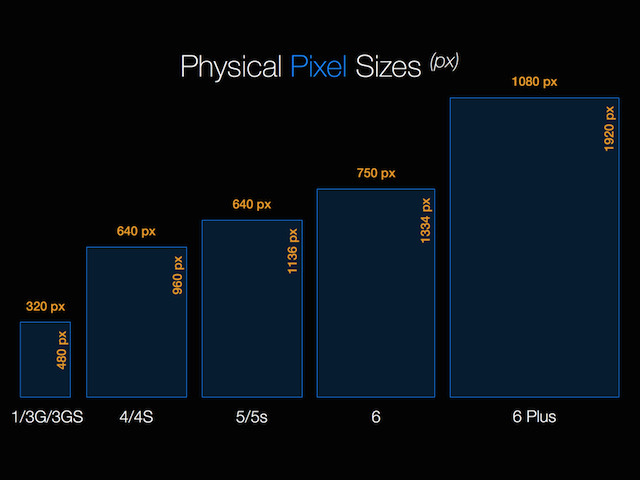
後來在iPhone4中,同樣大小(3.5 inch)的屏幕采用了Retina顯示技術,橫、縱向方向像素密度都被放大到2倍,像素分辨率提高到(320x2)x(480x2)= 960x640(PPI=326), 顯像分辨率提升至iPhone3GS的4倍(1個Point被渲染成1個2x2的像素矩陣)。
但是對於開發者來說,iOS繪制圖形的API依然沿襲point(pt,注意區分印刷行業的“磅”)為單位。在同樣的邏輯坐標系下(320x480):
1 point = scale*pixel(在iPhone4~6中,縮放因子scale=2;在iPhone6+中,縮放因子scale=3)。
可以理解為:
scale=絕對長度比(point/pixel)=單位長度內的數量比(pixel/point)
(2)UIScreen.scale
UIScreen.h中定義了該屬性:
// The natural scale factor associated with the screen.(read-only)
@property(nonatomic,readonly) CGFloat scale NS_AVAILABLE_IOS(4_0);
--------------------------------------------------------------------------------
This value reflects the scale factor needed to convert from the default logical coordinate space into the device coordinate space of this screen.
The default logical coordinate space is measured using points. For standard-resolution displays, the scale factor is 1.0 and one point equals one pixel. For Retina displays, the scale factor is 2.0 and one point is represented by four pixels.
--------------------------------------------------------------------------------
為了自動適應分辨率,系統會根據設備實際分辨率,自動給UIScreen.scale賦值,該屬性對開發者只讀。
(3)UIScreen.nativeScale
iOS8新增了nativeScale屬性:
// Native scale factor of the physical screen
@property(nonatomic,readonly) CGFloat nativeScale NS_AVAILABLE_IOS(8_0);
以下是iPhone6+下的輸出,初步看來nativeScale與scale沒有太大區別:
--------------------------------------------------------------------------------
(lldb)p (CGFloat)[[UIScreen mainScreen] scale]
(CGFloat) $1 = 3
(lldb) p(CGFloat)[[UIScreen mainScreen] nativeScale]
(CGFloat) $2 = 3
--------------------------------------------------------------------------------
(4)機型判別
在同樣的邏輯分辨率下,可以通過scale參數識別是iPhone3GS還是iPhone4(s)。以下基於nativeScale參數,定義了探測機型是否為iPhone6+的宏:
--------------------------------------------------------------------------------
// not UIUserInterfaceIdiomPad
#define IS_IPHONE (UI_USER_INTERFACE_IDIOM() == UIUserInterfaceIdiomPhone)
// detect iPhone6 Plus based on its native scale
#define IS_IPHONE_6PLUS (IS_IPHONE && [[UIScreenmainScreen] nativeScale] == 3.0f)
--------------------------------------------------------------------------------
那麼,同樣的分辨率和scale,如何區分機型iPhone4與4s、iPhone5與5s呢?通過[[UIDevice currentDevice] model]只能判別iPhone、iPad、iPod大類,要判斷iPhone具體機型型號,則需要通過sysctlbyname("hw.machine")獲取詳細的設備參數信息予以甄別。
7.Resolutions &Rendering
8.@2x/@3x以及高倍圖適配
(1)@2x
@2x means the same “double”retina resolution that we’veseen on all iOS devices with retina displays to date, where each virtual pointin the user interface is represented by two physical pixels on thedisplay in each dimension, horizontal and vertical.
iPhone3GS時代,我們為一個應用提供圖標(或按鈕提供貼圖),只需要icon.png。針對現在的iPhone4~6 Retina顯示屏,需要制作額外的@2x高分辨率版本。
例如在iPhone3GS中,scale=1,用的圖標是50x50pixel(logicalimage.size=50x50point);在iPhone4~6中,scale=2,則需要100×100pixel(logical image.size=50x50point,乘以image.scale=dimensions in pixels),並且命名為[email protected]。
如果APP要同時兼容iPhone3GS~iPhone6,則需要提供icon.png/[email protected]兩種分辨率的圖片。
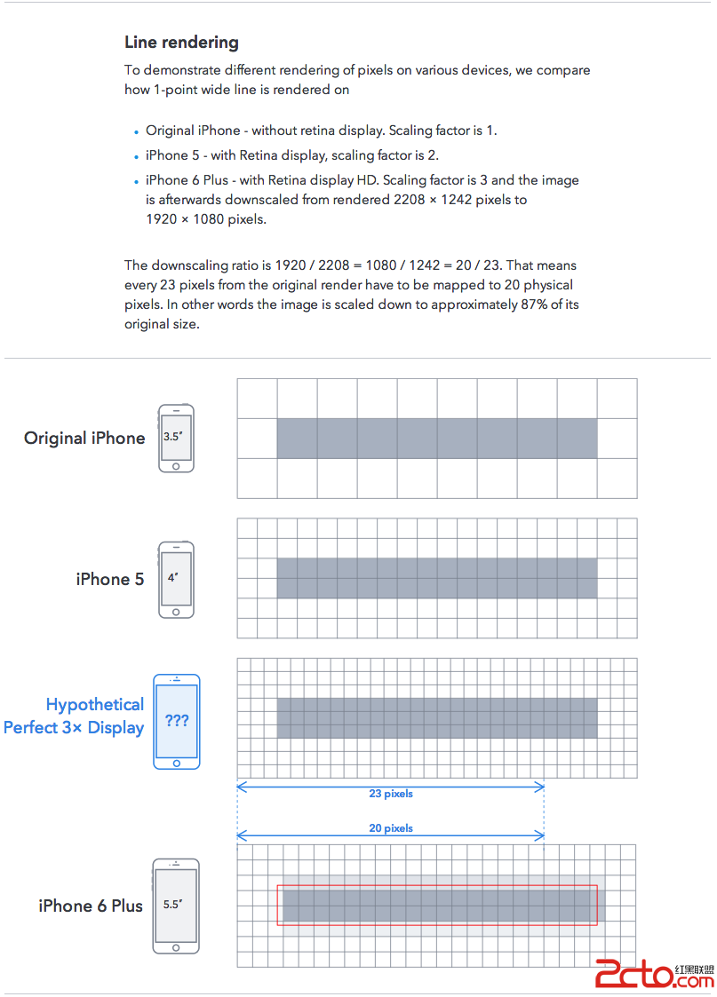
(2)@3x
@3x means a new “triple” retina resolution, where eachuser interface point is represented by three display pixels. A single @2x pointis a 2?×?2 square of 4 pixels; an @3x point is a 3?×?3 square of 9 pixels.”
iPhone6+在實際渲染時,downsampling/1.15(1242x2208->1080x1920),准確的講,應該是@2.46x。蘋果為方便開發者用的是@3x的素材,然後再縮放到@2.46x上。
參考:《為什麼iPhone 6 Plus要將3x渲染的2208x1242分辨率縮小到1080p屏幕上?》《詳解iPhone 6 Plus 的奇葩分辨率》《iPhone 6 Plus屏幕分辨率》
如果APP要同時兼容iPhone3GS~iPhone6+,則需要提供icon.png/[email protected]/[email protected]三種分辨率的圖片。
需要注意的是,iOS APP圖標的尺寸和命名都需要遵守相關規范。
(3)高倍圖文件命名
對於iPhone3、4/5/6、6+三類機型,需要按分辨率提供相應的高倍圖並且文件名添加相應後綴,否則會拉伸(stretchable/resizable)失真(模糊或邊角出現鋸齒)。
以下基於UIImage的兩類初始化API簡介高倍圖的適配:
<1>+imageNamed:該方法使用系統緩存,適合表視圖重復加載圖像的情形。同時該API根據UIScreen的scale,自動查找包含對應高倍圖後綴名(@2x)的文件,如果沒找到設置默認image.scale=1.0。因此,使用該方法,無需特意指定高倍圖後綴。在實際運行時,系統如果發現當前設備是Retina屏(scale=2),會自動尋找"*@2x.png"命名格式的圖片,加載針對Retina屏的圖片素材,否則會失真。
<2>+imageWithContentsOfFile/+imageWithData:(scale:)/-initWithContentsOfFile:/-initWithData:(scale:)
這組方法創建的UIImage對象沒有使用系統緩存,並且指定文件名必須包含明確的高倍圖後綴。如果文件名包含@2x後綴,則image.scale=2.0;否則默認image.scale=1.0,同樣對於Retina屏將會失真。
<3>目前,適配iPhone6+時,除了一些鋪滿全屏的大圖(LogoIcon、LaunchImage)需提供三倍圖,其他的小圖仍可沿用原有的二倍圖自適應拉伸。
9.Screen Bounds & Application Frame
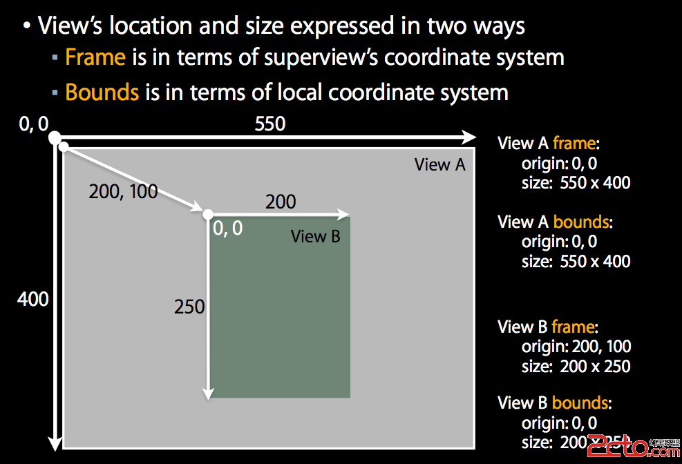
(1)UIScreen.bounds
// Bounds of entire screen in points(本地坐標系,起點為[0,0])
@property(nonatomic,readonly) CGRect bounds;
--------------------------------------------------------------------------------
//考慮轉屏的影響,按照實際屏幕方向(UIDeviceOrientation)的寬高
#define SCREEN_WIDTH ([UIScreenmainScreen].bounds.size.width)
#define SCREEN_HEIGHT ([UIScreenmainScreen].bounds.size.height)
#define STATUSBAR_HEIGHT ([UIApplicationsharedApplication].statusBarFrame.size.height)
//不考慮轉屏的影響,只取豎屏(UIDeviceOrientationPortrait)的寬高
#define SCREEN_WIDTH MIN([UIScreenmainScreen].bounds.size.width, [UIScreenmainScreen].bounds.size.height)
#define SCREEN_HEIGHT MAX([UIScreenmainScreen].bounds.size.height, [UIScreenmainScreen].bounds.size.width)
#define STATUSBAR_HEIGHT MIN([UIApplicationsharedApplication].statusBarFrame.size.width, [UIApplicationsharedApplication].statusBarFrame.size.height)
--------------------------------------------------------------------------------
(2)UIScreen.nativeBounds
iOS8新增了nativeBounds屬性,輸出豎屏像素級分辨率:
// The bounding rectangle of the physical screen,measured in pixels. (read-only)
// This rectangle is based on the device in a portrait-up orientation. This value does not change as the device rotates.
@property(nonatomic,readonly) CGRect nativeBounds NS_AVAILABLE_IOS(8_0);
以下是iPhone6+下的輸出:
--------------------------------------------------------------------------------
(lldb) poNSStringFromCGRect([(UIScreen*)[UIScreen mainScreen] bounds])
{{0, 0}, {414, 736}}
(lldb) poNSStringFromCGRect([(UIScreen*)[UIScreen mainScreen] nativeBounds])
{{0, 0}, {1242, 2208}}
--------------------------------------------------------------------------------
(3)UIScreen.applicationFrame
// Frame of application screen area in points (i.e.entire screen minus status bar if visible)
// bounds除去系統狀態欄
@property(nonatomic,readonly) CGRect applicationFrame;
--------------------------------------------------------------------------------
// APPFRAME_WIDTH=SCREEN_WIDTH
#define APPFRAME_WIDTH ([UIScreen mainScreen].applicationFrame.size.width)
// APPFRAME_HEIGHT=SCREEN_HEIGHT-STATUSBAR_HEIGHT
//注意:橫屏(UIDeviceOrientationLandscape)時,iOS8默認隱藏狀態欄,此時APPFRAME_HEIGHT=SCREEN_HEIGHT
#define APPFRAME_HEIGHT ([UIScreen mainScreen].applicationFrame.size.height)
--------------------------------------------------------------------------------
(4)bounds和frame的區別
下圖展示了bounds和frame的區別:
10.機型尺寸適配(Screen Scale Adaption)
從iPhone3GS/iPhone4(s)過渡到iPhone5(s)時,在邏輯上寬度不變高度稍高,之前舊的素材和布局通過AutoresizingFlexible簡單適配即可運行得很好,但由於高寬比增大,上下兩端出現黑粗邊(典型如LaunchImage)。從分辨率的角度來看,除了需要提供LaunchImage這種滿屏圖,其他基本沿用二倍圖(@2x);從屏幕尺寸角度來看,需要對縱向排版略加調整。
從iPhone5(s)發展到iPhone6(+),由於高寬比保持不變,iOS對圖標、圖片、字體進行等比放大自適應,清晰度會有所降低。同時,絕對坐標布局會導致在大屏下出現偏左偏上的問題。從分辨率的角度來看,iPhone6沿用二倍圖(@2x),但需為iPhone6+提供更高的三倍圖(@3x);從屏幕尺寸角度來看,需要重新對UI元素尺寸和布局進行適配,以期視覺協調。
(1)按寬度適配
我們先來看一下iPhone4~6(+)的屏幕高寬比:
iPhone4(s):分辨率960*640,高寬比1.5
iPhone5(s):分辨率1136*640,高寬比1.775
iPhone6:分辨率1334*750,高寬比1.779
iPhone6+:分辨率1920*1080,高寬比1.778
可粗略認為iPhone5(s)、6(+)的高寬比是一致的(16:9),即可以等比例縮放。因此可以按寬度適配:
fitScreenWidth= width*(SCREEN_WIDTH/320)
這樣,共有iPhone3/4/5、6、6+三組寬度,在iPhone6、6+下將按比例橫向放大。
(2)按高度適配
在同樣的寬度下,iPhone4(s)的屏高比iPhone5(s)低,若縱向排版緊張,可以iPhone5(s)為基准,按高度適配:
fitScreenHeight= height*(SCREEN_HEIGHT/568)
共有iPhone3/4、5、6、6+四組高度,在iPhone3/4下將按比例縱向縮小,在iPhone6、6+下將按比例縱向放大。
這裡需要注意iPhone/iOS雙環上網的熱點欄對縱向布局的影響:iPhone作為個人熱點且有連接時,系統狀態欄下面會多一行熱點連接提示欄"Personal Hotspot: * Connection",縱向會下壓20pt,[UIApplication sharedApplication].statusBarFrame高度變為40pt;當所有連接都斷開時,熱點欄消失,縱向高度恢復正常為20pt。詳情可參考《iPhone/iOS開啟個人熱點的縱向適配小結》。
(3)按字體適配
另外,iPhone的【設置】【通用】【輔助功能】中可以設置調節【更大字體】,APP也可以按字號適配:
例如適配表視圖(UITableView:UIScrollView),無法左右滑動,因此無論字號縮放比例多大,橫向都不應超過SCREEN_WIDTH。注意限定控件元素內容區域寬度以及間距,並設置適當的LineBreakMode。表視圖支持上下滑動,因此縱向上的表格行高和內容區域高度可按字號縮放。
對於縱向也不支持滑動的視圖,在屏幕可見視區內排版時,最好不要隨字號縮放,否則可能超出既定寬高。
11.UI相對布局
考慮到iPhone機型的多樣性,不可能針對iPhone4(s)、5(s)、6、6+四種屏幕尺寸出四套視覺交互稿,也不要基於某一機型從上往下、從左往右給絕對標注,而應該關注subView在superView中的相對位置(EdgeInsets/Frame/Center)以及siblingView之間的偏移(Offset),盡量給出適合Autolayout的相對布局比例(理想情況是只給百分比)。假如交互按照iPhone5(s)下絕對標注,則在iPhone4(s)上可能擠出屏幕底部,而在iPhone6(+)上則可能橫向偏左或縱向偏上。
開發人員基於與屏幕邊緣的間距(Margin/EdgeInsets),定位邊緣處的控件(釘釘子)作為參照,然後基於控件尺寸和間隙進行相對計算排版。這樣,若釘子移動,相鄰控件將順向偏移,不會因為局部調整而出現凌亂。
蘋果在WWDC2012 iOS6中就已提出了Auto Layout的概念,即使用約束條件來定義視圖的位置和尺寸,以適應不同尺寸和分辨率的屏幕。
12.DEPRECATED API適配
最後,除了對屏幕尺寸和分辨率進行適配之外,還需對iOS SDK中相關的DEPRECATED API進行適配。典型的如:
(1)UILineBreakMode->NSLineBreakMode
(2)UITextAlignment->NSTextAlignment
(3)sizeWithFont:->boundingRectWithSize:
(4)stretchableImageWithLeftCapWidth:topCapHeight:->resizableImageWithCapInsets:
(5)...